Fall and Folds

Vesna Pavlovic’s exhibition “Fall and Folds,” will delight contemporary art connoisseurs and art history students alike. Pavlovic’s work examines trends in art extending to the renaissance, through a contemporary lens. Her compelling appropriation of art history slides shows the works of many well-known and impressive artists reframed within the context of pedagogy.

tintoretto
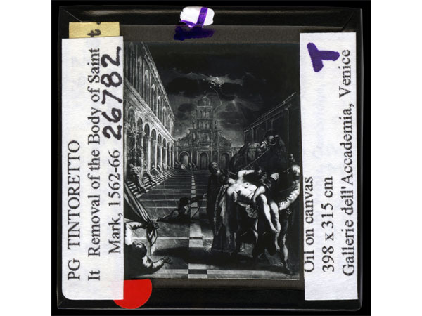
PG TINTORETTO It Removal of the Body of Saint Mark, 1562-66, 30 x 30 inches, endura metallic color print with metal stand, edition of 3

Perhaps the most striking objects of the exhibition are the curtains, which take on various tasks, reflecting the perpetually turning slide monitor, providing backdrop to works of art, and altering the light coming into the gallery; mirroring that of a dimmed art history classroom. Pavlovic’s slides also bring forth the vernacular of art historians with large black emblazoned letters detailing college campuses from whence the slides came, as well as details of their originals.

greek
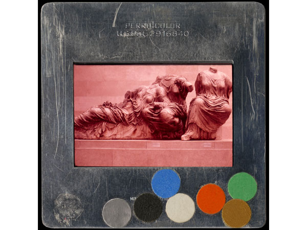
GREEK: ARCH: ATHENS GEN: ACR: PARTHENON: EPEDIMENT GODDESSES, 30 x 30 inches, endura metallic color print, edition of 3

This duality of presenting famous turn-of-the-century works of art through a didactic lens creates an oscillation between now and then, contemporary and antiquated, revolutionary and appropriated. Pavlovic’s work provides a new context for fundamental artistic studies, placing them as artifacts rendered contemporary. Bordered by diaphanous curtains, even the texture of the material projected upon becomes an augmentation of the antiquated. What is stands out most is that Pavlovic’s slides, enlarged and hung, are incorporated into the slide projector reel, flashing across a draped slightly transparent curtain of plastic. When one enters the gallery, they see the slides, enlarged and with their full and original texts, against the dimmed light created by the curtains and hear the click of the projector reel as it turns. Pavlovic’s art is double-edged in that regard, perpetuating notions of art history teachings in darkened lecture halls, as well as calling forth the use of detail, shadow and light in classical and early modern painting.

slide
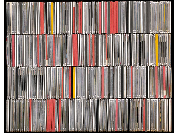
Slide Cabinet, 30 x 38 inches, archival pigment print, edition of three

Pavlovic also photographs in detail images of the various colored dots used to signify certain information on a given slide, as well as the slides themselves. A choice that shortens the distance between images of slides as art and image of slides and images of slides. These details focus on that of the art history world and how items such as projector slides are preserved. On view until July 30th, stop by this week to see how whitespace has been transformed into a place of pedagogy: in which classical images are elevated to high contemporary art.

Happiness Project

Happiness Project by Didi Dunphy is a critical examination of high design via commodification, craft and fantasy. Her emphasis lies within the making of each piece, the things unseen.

QVC, a startling collection of photographs of gorgeous rings displayed against pink backgrounds with doily-like borders, is a fantastical exploration of the commodity.  Despite the piece’s obvious allusion to QVC, the shopping TV channel, the images cite more than simply online shopping desires. The depictions of individual rings draw attention not only to their own intricacies and precious stones, but to the human hand, the wearer, the individual behind the jewelry. Though none of the images acknowledge in any way, other than that they are objects for hands themselves, the wearer or the individual, their congruence along an entire wall of whitespace paints a portrait of ownership. QVC is a portrait, perhaps not of any one specific individual, but of the nature of the commodity itself. Rings are objects of personal augmentation, and though they are mere objects, there is a story behind the acquisition of each one. In displaying images of jewelry meant to be worn, what is unseen is precisely what is emphasized, in this case, humanity and its relationship to the commodity.  In QVC, the viewer is presented only with the rings themselves, left to wonder about the rest, the story, the history. The viewer must discern information from the presentation of each individual ring in order to come to a conclusion, or simply enjoy the pieces as commodities themselves.

Not only do these rings cite the luxury of owning such objects, but other pieces, like Industrial Emoticon tip their caps, so to speak, to the banal. Dunphy, of course, in her project elevates these commonplace, albeit elegant, items to the lavish and fantastical. Industrial Emoticon alludes to the iconic 1960’s Arco lamp, a lavish commodity for any home during its peak of popularity. The overblown happy face, clouds and heart cut from plexiglass alter the iconic images of the Arco towards the fanciful and imaginative, taking high design to a place of play and visual communication. The bright colors and overblown qualities cite artists like Jeff Koons. Through Dunphy’s attention to popular culture depictions of emoticons and her alteration of the Arco, the banal is transformed into the unique, shiny and effervescent. Here, Dunphy has elevated previous conceptions of luxury objects to pop culture expressions of emotion. Alluding to the emoji, an emoticon used for expression, Dunphy juxtaposes the classic and iconic with the contemporary and technological.

Dunphy_CampfireDidi Dunphy, Campfire, 24 x 36 inches, lambda print on fuji flex mounted on plexi

Other designs similarly reference iconic objects and images. Hanging Garden mirrors a 70s shell lamp or night club curtains. All the Things I Can’t Live Without: Nails depicts images of Piet Mondrian’s Compositions with Red, Blue and Yellow, accomplishing similar messages of commodifying high art. Other acrylic nails depict images of hello kitty, clouds, colorful squares and flowers. These images, like QVC cite the hand, the individual behind each set of nails. Compared to Dunphy’s five intricately embroidered pieces, all place an emphasis on color, its brightness and shine, as well as handiwork, the work of craft. Both acrylic nail painting and embroidery are typically female gendered crafts and both represent objects acquired out of luxury or excess. Both reference the individual behind the work, the person who accomplished the project.

Several other pieces depict images of campfires, from sketches with smoke crafted from brightly colored and holographic teacher’s pet stickers, to a large hot-pink plexiglass print of woven colorful lanyards to Dunphy’s pink Donald Judd-like sculpture depicted below. These images reference the joys of childhood, the simplicity of that childhood happiness and the escape of camp. Placed next to Faerie Ring, photographs of faerie circle mushrooms, works like Picket, a fluorescent aluminum 8-foot propped fence and Twins, two chain link and picket fence tiaras, similarly to All the Things I Can’t Live Without: Nails, take part in depicting the other side of luxury, the hard work behind the exquisite. In some way, all of Dunphy’s work cites the excess of high design and extravagant living, and yet also references hard work, the skill of craft and the conceptual elements behind these facades of brightly colored, shiny beauty. Dunphy’s conceptual work is illuminated in this space between craft and luxury. Her attention to the intersections between design, pop culture, feminity, fantasy, and the unseen, are truly what make Happiness Project, an examination of much more than the objects themselves, but the conceptual as well. 

Screen Shot 2016-05-19 at 11.48.57 AM

Didi Dunphy, Fire Logs, size variable, wood, airbrushed paint

Written by: Hilleary Gramling

Abstraction Today

The exhibition, Abstraction Today, at the Museum of Contemporary Art of Georgia (MOCA GA) opened Friday night at 6:30 p.m. The most prestigious and prominent art galleries in Atlanta compiled the artists’ works and the opening was filled with guests, a bar and merriment. Whitespace had the honor of participating in this collaboration with Alan Avery Art Company, Marcia Wood Gallery, Mason Fine Art, Sandler Hudson Gallery and {Poem 88}. With pieces from Pete Schulte, Ann Stewart, Bojana Ginn, Eric Mack and Seana Reilly, whitespace’s artists augmented the exhibition incredibly from wall paintings to 3D printed objects to sculpture. In conjunction with other artistic selections, the show was a congruent and diverse examination of what abstract art is in today’s contemporary world.

Though each artist presented their own negotiations of what it means to be abstract, the entire collection of art offered an exceptionally harmonious exhibition. whitespace artists in particular not only showed work that charged the white walls of MOCA GA, but also formed a coherent representation of the free-expression, intimacy, dialogue, and immersive environment whitespace strives to represent. The looming grace of Schulte’s wall painting alone overwhelmed the northern wall of one room, but reflected against the colorful and overwhelming wall work of Hense, added great contrast to envelop the night’s crowd.

IMG_8082Dark Day (Revelator Pt. 2), Pete Schulte, 2016

In a smaller room to the side, an installed projector and sculpture made of straws, paint and cotton by Ginn mirrored the pixelated, almost urban abstract landscape of Mack’s multi-medium work. Beautifully and breathtaking, Stewart’s 3D printed objects cast long and opaque shadows against the white walls of the space as one of the first works in view of the entrance of the exhibition. Across from Stewart, Susannah Starr’s large floral and vibrant neon cut-outs refracted the light via their own technique, presenting a delightful juxtaposition of shadow play for Stewart’s objects. And Reilly’s floor to ceiling canvases overwhelmed what was left of the room with their ombre and bleak exploration of gradient and texture.

IMG_8085
Diamagnetic Liaison, Ann Stewart, 2016

What was best about Abstraction Today was the physical manifestation of the diversity and talent that can be found in Atlanta. Each artist’s work illuminated an aspect of its neighboring pieces and vice versa. The space was filled with detailed conversation, immense artistic exploration and wonder. The exhibition’s navigation of what it means to be abstract is a testament to the greatness of today’s contemporary art, not only in the world, but right here in Atlanta. From modern advances in technology, projection and 3D printing, to wall-painting, traditional sculpture and manipulation of found objects, the exhibition is a beautiful tapestry woven by the many threads of experimentation, risk, exploration and abstraction today.

Written by: Hilleary Gramling

Nocturne: Myth, Magic and Decay

Wendy Given and Ryan Pierce have collaborated to present a variety of new sculptures, paintings, drawings and photographs drawn from the intersection of their creative visions: the nocturnal, the nonhuman, and the wildness that resides in each of us. Nocturne presents an otherworldly collection of natural, surreal, mysterious and awe-inspiring work that draws the viewer into a mode of processing and understanding nature, folklore, myth and mystery.

Given-Of_the_Garden_VitisWendy Given, Of the Garden: Vitis, 2014, 40″ x 40″, c-print, edition 1/3

Flowers droop in decay from an upside down sculpted head vase, a white peacock looks over his shoulder surrounded by preserved moss, palm leaves, flowers and ferns, a gilded scythe hangs on the wall inscribed with a prayer to the natural world, a sketched vulture consumes an atrophying human carcass against a dark background, botanical illustrations marry the surreal with the biological, a mirrored octahedron rests in the center of one room, reflecting a photograph of close-up moth fur, beetles consuming grapes, a raven clutching an animal skull in its beak, and a giant chandelier made of peacock feathers.

Given and Pierce’s work suspends time and reality in a meditation on the surreal and the unexamined: a moth rests in a vintage glass box, cameo style images of panthers atop pine trees and mystical forces of the night hang on the wall, and a painted rendition of a glass box broken at the base of a trickling creek overwhelms part of the room. The folk art-feel of the exhibition illicits a sense of dread, that reality is centered in myth, that decay and death are all around us, that we are uncertain. Both rooms in whitespace’s gallery have their own essence of the natural. One is a space of observation and mystifying beauty of the preserved. The other feels vintage and antique, featuring the kinds of artifacts one may find in a grandmother’s attic.

The universal message of this collaboration is one of appreciation, examination and presentation. The appreciation of the natural world in all its elements, plants, moths, a coiled white snake, a white peacock, panthers; an examination of life and a collective consciousness surrounding the natural, mortality, the circle of life; and a presentation of nature’s cruel and yet, just forces.

ark_webtwoDetail, Ryan Pierce, Chance Arc, 2012, 72″ x 47″, Flashe on canvas over panel

Given and Pierce’s collection is one of the beauty found in the forgotten and the unobserved, but also a confrontation. We, as humans, are all dependent on the natural world, and yet, we are responsible for its desecration.

Written by: Hilleary Gramling

The Bear, Faulkner and Territories/Kingdoms by Mimi Hart Silver

Often, in the world of creativity, different imaginative mediums serve to influence each other. Pablo Picasso’s work heavily influenced architecture through his principles in Cubism, especially in the Czech Republic. Buildings like the Hodek Apartment House reconcile Picasso’s revolutionary findings of art with architecture and local tradition. Similarly, artists like Marina Ambramoviç and Ulay combine experimental concepts with artistic performance and body art. Even here, in our very own artistic space, Poetry has wandered into visual artistry (if you recall our whitespec show in the summer months, Pathways, by Nicole Livieratos — Livieratos utilizied words of poetry in her installation). Among these few examples, Mimi Hart Silver’s work is no less of an important notch in the belt of influenced and combined art forms.

During our Saturday Salon two weeks ago, many Atlanta locals gathered together to understand and discuss the influences of William Faulkner’s work on Silver’s exhibition. Lead by Faulkner scholar Tom McHaney, the talk covered topics from Faulkner’s life, his writing of The Bear as well as Silver’s own attraction to the famous author’s words.

In Territories/Kingdoms, Silver examines her roots as a Southerner, presenting 2D work across multiple mediums, all in conversation. Paper has been manipulated to resemble hide or skin. These fragments are patched together to convey an illusion of an aerial standpoint, geographic landscape and crude map-like visuals. Paired with classically rendered abstract oil paintings detailing blurred images of a bird hunt, the result is an eerie and haunting portrayal of biological and hierarchical divisions. As discussed during the Salon, Faulkner’s attention to that of the primitive, the raw, the survivor, are all notions brought up in the viewing of Silver’s works.

McHaney brought images of drawings created by Faulkner in his early days. Providing insight into Faulkner’s writing by reading an excerpt from the text of The Bear, McHaney enchanted the crowd with the lore-like style of Faulkner’s distinct prose. Posing questions to Silver about the nature of her work, a discussion of themes (common between Silver and Faulkner), relating to the rough characterization of Southern indifference, were addressed. The attention to the South: as a place of deep-rooted tradition, a place charged with violence in the animal hunt and in ways of life, and a place where the nature of human instinct in terms of trauma comes to fruition, provided insights into human tragedy as a coping mechanism. Silver’s articulation of Faulkner as a key influence in her work through his reverence for the wild, the untamable, the deepest animalistic drives, was key in achieving a deeper understanding of Silver’s work.

McHaney’s insights to Silver’s explanations not only illuminated the works being shown at whitespace, but also provided a closer look at trauma and memory. Silver’s images of wings, legs, breasts and animalistic body part roped together in the aftermath of carnage and the permeation of violence, were augmented by a discovery of Faulkner’s work as an articulation on survival in the wild. The discussion of both Faulkner and Silver’s interests in the continuum of life and death, charged the gallery space with curiosity as all participants stepped into the search for meaning in human tragedy for a brief time, together.

Written by: Hilleary Gramling

Photos by: Sierra Cortner


A Guide to Navigating the Art World

Almost everyone’s initial understanding of art is that it is intimidating. Though I am an Art History major, I still struggle with feeling like I don’t know enough to intelligently talk about art. When discussing art with my peers or colleagues, the conversation is usually initiated with some sort of disclosure: “I really like this piece but I’m not really an art person” or “I just don’t think I know enough to state my opinion.” While knowledge is valuable, this sort of reluctant approach should instead be a confident one. We all talk about our favorite books and movies without hesitancy. We should be able to discuss art in the same way.

Bottom line: regardless of one’s exposure to the art world, anyone is entitled to and perfectly capable of understanding and discovering the joys of art. While there is always something new to learn, art is for everyone to appreciate! In order to navigate a seemingly intimidating space, here are some helpful tips to consider when appreciating or even purchasing art.

Doors I by whitespace artist Amy Pleasant, 26 x 34 inches, ink and lino cut on paper

  1. Do your Research: Everyone has personal taste when it comes to the creative realm, but taste is also something to cultivate. You may not know that you enjoy large abstract images, expressionist photography or geometric drawings until you’ve exposed yourself to a range of artistic movements. It’s important to expose yourself to as much as possible before determining what you do or do not like. Consider visiting museums, art fairs or local galleries to cultivate your taste. Give yourself enough time to understand what you truly enjoy visually, especially if you are considering buying art for your home or office space.
  2. Explore your Options: There are many places to buy art, but consider your local options before looking elsewhere. Every major city is teeming with passionate artists ready to show their work. Look to galleries who work closely with and support artists of all types. Look to passionate art dealers who know their artists’ work inside and out. They will be able to provide support for the artists’ future credibility and knowledge to you as you search for the right pieces to enjoy.
  3. Maintain Perspective: Just because you are interested in “buying art” doesn’t mean you have to spend a fortune! Depending on the artist and gallery, you can find works ranging from a couple hundred dollars to thousands of dollars. Whether you are an art collector or someone just looking to buy something to enjoy, affordable pieces are more than within the realm of possibility. Maintain the right perspective in terms of what works for you financially and you’ll find something for the right price.
  4. Discover New Things: Art is not just painting or drawing! The art world encompasses everything from public art, design, photography, sculpture and installation to mixed media and painting. You may discover that you enjoy conceptual art as much as black and white photography. Don’t limit yourself based on just one facet of art! Be open to discovering new creative preferences.
  5. Remember what you Love: Pay attention to how certain pieces make you feel; especially when considering purchasing a piece for your residence or office space. It is also important to know things about the artist such as: their previous work, who is writing about them, what they have accomplished and where they started from. These facts are not only interesting to learn but also smart to note so you can determine the future value of a piece. Regardless of whether a work will increase in monetary value, if you simply love seeing a piece of art hanging above your kitchen table every day then that is enough value as well!

Sources: CNN, The non-millionaire’s guide to buying art by Kate Bryan

Written by: Hilleary Gramling

Causa Sui

Ann Stewart’s opening for Causa Sui drew a delightful crowd to whitespace gallery this past Friday. The weather was warm and as the temperature cooled, the heat of the day faded into a comfortable summer evening for all who attended. Guests flowed from room to room to gaze upon Stewart’s three-dimensional objects and graphite etchings and the conversation hummed as visitors observed her work. Stewart’s collection is entirely enthralling; the geometric forms of both styles of her work visibly inform one another creating a beautiful cohesiveness to the space.

Her 3D objects are suspended in transparent cubes in each room of the gallery so guests are able to closely examine them from all angles, an interaction that pulls the viewer into the installation, informing a more detailed understanding of the work. This kind of interaction is necessary in order to fully appreciate Stewart’s objects: their intricate facets, incisions, slices, edges and protruding planes are incredibly small and exact. Stewart creates her objects with a 3D printer. A unique process (see detailed explanation here https://www.youtube.com/watch?v=qCThfUhVftw) involving computerized images of the objects before they are printed. This process also mirrors the title of the show, Causa Sui. The term causa sui is Latin for “cause of itself.” Once Stewarts prints an object, it creates itself.

Her objects and drawings all operate employing a centrifugal force, gaining their momentum from central forms. Her objects coil or protrude outward in complex patterns and her drawings employ a similar format, utilizing negative space in tangent with their faux symmetric geometry. The largest piece in the center of the main room of whitespace, entitled “Oscillator” is beautifully drawn and shaded, maze-like in its geometric imagery. All her drawings are black and white and collapse the distance between figure and ground resulting in an illusionistic experience for the viewer. The drawings come to fruition through their nearly 3D appearances. Oscillator inhabits the same room as three of the largest 3D objects entitled “Sight Path,” “Sui Genesis,” and “Big Bang Baby.” One can see the influence of Stewart’s particular style upon these four large pieces.

Stewart’s practice of pattern recognition and pattern generation in the creation of the objects and etchings is an effort to negotiate the relationship between randomness and structure and investigate the visualization of perception. As viewers flanked the objects, leaning in to get a closer look examining the pieces’ precarious and convoluted forms, this negotiation was facilitated in a physical space and a deeper understanding of how the objects operated was fostered.

Along with Stewart’s work, whitespec featured a new artist as well, Geewon Ahn. Her body of work titled Between Absence and Presence drew the crowd’s attention as well. Made from cable ties entirely, Ahn’s work extended beyond the space of whitespec into the courtyard. Three of her sculptures inhabited the space along with the evening’s visitors. Otherworldly in their forms, Ahn’s work complemented Stewart’s objects quite beautifully. In an examination of loss and memory, Ahn navigates the relationship between form and negative space as well, creating pieces that necessitate close inspection and interaction. Her pieces are rounded in nature, some of which made up of components that protrude into the space of the viewer. Balanced by the work of Stewart, Ahn’s pieces created an engaging and invigorating experience for all who attended.

Written by: Hilleary Gramling