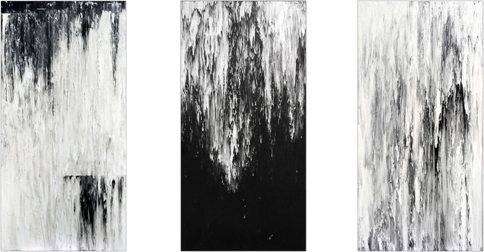
(from left to right) ProfferedStone, ChthonicCourse, FrozenCadence, 2016, Seana Reilly
Seana Reilly’s latest show at whitespace is a cross between a library and a church, temple, or cathedral. With gothic and other architectural influences, Eastern and Western religious motifs and a quieting quality, Docking on the Orphic Shore is reverential. For this blogpost, we decided to interview Seana to get a better understanding of the materials, her process and the creation of the show in whitespace.
Hilleary: Your show feels absolutely sacred and spiritual. Docking on the Orphic Shore is a representation of that place we all seem to be trying to get to, whether it is heaven in Judeo-Christian religions, or Nirvana in Buddhism, the Orphic Shore seems to be that place as well.
Seana: It’s about trying to lose your edges and connect with something larger than yourself. It expands outward beyond the physical limits of your body. Sometimes religions will help people do that. Sometimes science with its endlessly evolving frontiers can help people get there. Poetry can as well. There are so many different paths – it’s whichever suits you as an individual. One expression for me of this dissolution of the self is in the piece titled OrphicSonnet. It’s a transcribed Rilke poem – as I moved down the surface losing myself in the writing, three lines behind me the words were starting to migrate and change, losing themselves. Once the piece was done I found it kind of interesting that the image was very recognizable as text-based, but at the same time completely unreadable, illegible. I don’t think you can put this larger experience into words, so it’s rather fitting.
H: You and I have spoken about the materials before, but how would you describe working with them and your process?
S: My process is more participatory practice than ritual. It’s a communion of sorts. I’m always trying to balance control and chaos. When working with the graphite there are a few things I can control and make decisions about, such as the viscosity, the substrate, or the scale. That’s where my architectural background asserts itself… the defined space, the pristine edge, the square format. But once those decisions are made and the material is released into that framework, I surrender control. The graphite can be prodded a bit – in the service of broad aesthetic decisions – but it has certain inherent qualities that produce particular kinds of affects or patterns. This is what fascinates me… how the material mimics planetary-scale processes in nature. Some of the works read as landscapes, but any representational aspects of the work are accidental and unbidden. I neither erase nor encourage these. More than anything I’m intrigued by them.
H: What about the gray walls in that room? How did you decide to create that as part of the exhibition?
S: The two rooms are different. Works in both spaces are graphite, but graphite in two different forms and applied in two different ways. I kept all the tactile hands-on paste graphite in the first room because I wanted a grounded place to enter into first. It’s also a very bright white room and sets up a contrast with the other darker space with the liquid graphite pieces. It’s markedly different when you step up and across that threshold into the room with the books. In thinking about this room I kept coming back to both a sense of drama and stillness. I spent some time at the Carlos Museum. They do it well – I think it’s all in the value shifts in color & lighting. I chose the mid-value grey walls to tone down the space energetically, and in a practical sense it helps to set off the white portions of the works which get lost on white walls.
H: There is a rhythm to the whole space something that ties it together as a whole, could you speak on to that?
S: Obviously, there’s consistency of palette and material. That helps. I also like working in series, so there’s a rhythm built into that. There’s a consistency of presentation as well. The series of vertical paintings between the books, for example, sets up a repeating rhythm that leans toward religious architecture and also toward museum presentations of ancient tablets and scrolls. Then you intersperse the books, also done in series… Books of this size are usually reserved for deep records of knowledge or spiritual guidance, so they lend a certain weightiness to the room, both visually and atmospherically. The intent and presentation is consistent. At least that’s what I was shooting for. One other thing that may help is the continuity of visual language throughout the show. Every piece in the show is an expression of the way the earth was formed – not in some abstract way, but a physical manifestation of the laws of gravity and fluid motion. The books are not full of alphanumeric symbols or pictorial allegories pointing to things outside of themselves. They are full of nature itself, as are the paintings.